When you buy a house, you don't ask the seller whether it's a good house. You bring an inspector, and the inspector brings a checklist for the foundation, wiring, roof, etc. The checklist doesn't care what the listing photos look like. Buying a data platform for an environmental program deserves the same discipline, and almost nobody walks into the demo with a checklist.
So here's ours. Twelve dimensions, each phrased as a question you can put to any vendor including us. I'll tell you at the end where we score well and where we don't, because a rubric you can only win with isn't a rubric, it's a brochure.
Why demos need a checklist
Demos optimize for what demos can show: a dashboard appearing, a chart animating. But most of what determines whether you can stand behind a number two years from now is invisible in a demo, what happened during transformations, whether the quality flags have provenance, whether anyone recorded that the sensor at site 4 was swapped in March. The expensive failures in environmental data are quiet, and quiet things don't demo. A checklist is how you make the quiet things speak.
One framing note before the list: we score every dimension for three deployment sizes: a small program (a handful of sensors), a mid-size network (a dozen or a few dozen), and a large industrial deployment (hundreds to thousands of individual sensor channels). The same tool can be the best answer at one size and the worst at another. Keep your own size in mind as you read.
The domain-completeness six
These first six decide whether the platform understands your work, or whether you'll be teaching it.
1. Domain data model. This is the foundation the inspector checks first. Does the platform natively know what a site, a sampling location, an instrument, and a measured metric are, or does it hand you generic tables and wish you luck? Ask: "Show me where a sensor location lives in your data model." The trap: "you can model anything" means "you will model everything."
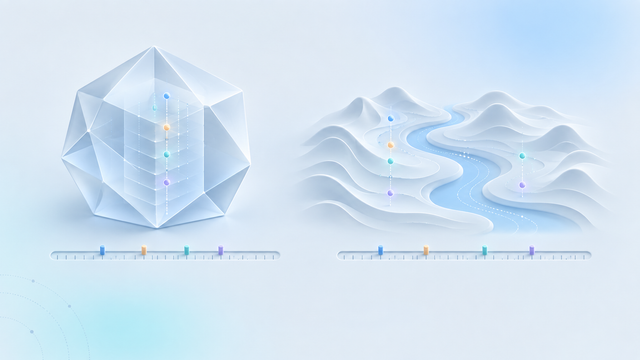
2. Gap-preserving harmonization. This one is the wiring that sits invisible until something shorts. When data from mismatched instruments is aligned onto a common timeline, what happens to the minutes a sensor was offline? The default path in most tools (resample, forward-fill, pivot) fabricates readings there. Ask: "If a sensor goes dark for six hours, what exactly appears in the harmonized series?" The only good answer is: a gap, unless you explicitly chose otherwise. (In Datasparks, raw data always keeps an untouched observed series, and every harmonized variant carries a gap tolerance. Beyond the gap fill tolerance, the record stays empty.)
3. Quality rules with provenance. Can quality logic be written once, reused across datasets, and, the part almost everyone skips, can you prove afterwards which rules ran on which data? Taking it further, when you add a new quality rule is the data that's already there reassessed? Ask: "For this flagged value, show me the rule that flagged it and when." A quality flag without provenance is an opinion.
4. Curated data products. Is there a first-class concept of a governed, versioned output, the dataset you actually use or hand to a client or regulator, with freshness tracking? Or is "the deliverable" whatever CSV was exported most recently? Ask: "How do I know this shared dataset is current, and what version the client saw?"
5. Heterogeneous ingestion and mapping. Real programs ingest by file upload, scheduled API pulls, and device push, often all three, from vendors who disagree about headers, timestamps, and units. Ask: "Map this vendor's export without writing code." Watch whether the answer involves a professional-services quote.
6. Non-technical delivery. Can the program manager and the client see charts, dashboards, and shared views without a developer in the loop? The trap: "our API makes integration easy". An API is delivery to engineers, not to stakeholders.
The power-and-economics four
7. Raw analytical and AI power. How capable is the engine and the AI on top of it, in absolute terms? I'll say this plainly: this is the dimension where the hyperscalers like Snowflake, Databricks, and the cloud giants behind them win, full stop. Snowflake and Databricks ship (and subsidize) more raw AI capability than anyone in this market, us included. Score it honestly, then read dimension 12 for the other half of that story.
8. Self-serve without a data engineer. Between the demo and daily operation, whose hands are required? Ask: "Walk me from a new instrument's first file to a shared chart, and name every role that had to touch it."
9. Interactive speed. Exploration only happens when queries come back fast enough that you keep asking. Ask: "What happens to query time when I'm on hotel wifi?" (Our answer: after the first sync, queries run inside the browser itself, so exploring doesn't round-trip to a server at all.)
10. Ingestion throughput per dollar. Not peak throughput, but throughput per dollar at your job sizes. For the sub-100 GB jobs a sensor network actually produces, published benchmarks show single-node engines beating rented Spark clusters by wide cost margins; above a terabyte the picture reverses. Ask: "What does ingesting our typical month cost, on your meter?" We've run the numbers on this one separately.
The two nobody scores
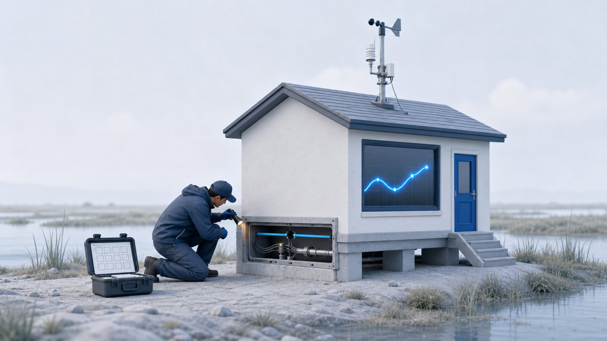
11. Deployment lifecycle as provenance. The inspection item nobody thinks to check. Sensors get deployed, swapped, and moved. Does the platform treat those as first-class, time-stamped events that data attribution actually consults so that "which instrument produced this reading" is a query, not an email thread? In our research scan, no mainstream alternative natively links deployment changes to data attribution: IoT platforms keep a current-state device registry, historians make you hand-build event frames, warehouses give you tables to build it yourself. This dimension is why the sensor you swapped in March is either a two-minute lookup or a two-week investigation.
12. Domain-aware AI. The inverse of dimension 7: not how powerful the AI is, but whether it understands the domain it's summarizing: gaps versus zeros, quality flags, what the instrument measures. A powerful generic model confidently misreads sensor data; a domain-grounded one is useful even while it's young. Nobody in the field scores high here yet, ourselves included. We'd claim "early and pointed in the right direction," not "mature."
How the field scores
We scored the major options across all twelve dimensions, for each deployment size. The method note: these are our calls, built from public documentation, published pricing, and published benchmarks — and where a vendor is opaque about feature depth, we reasoned from their architecture and said so in our notes. We did the homework, but we're not neutral judges here. Treat the table as a starting argument, not a verdict.
| Overall fit (0–100) | Small | Mid | Large |
|---|---|---|---|
| Datasparks | 85 | 90 | 85 |
| DIY (Excel + Python + BI) | 60 | 35 | 12 |
| ThingsBoard | 18 | 42 | 58 |
| Custom build (Airflow + cloud) | 20 | 35 | 50 |
| Snowflake / Databricks | 15 | 35 | 55 |
| Data historian (PI, Canary) | 5 | 20 | 55 |
And yes: we're bolded highest in every column of our own table. That should make you suspicious. I'd be suspicious. The real mechanism is that a composite score favors the balanced generalist over narrow specialists, and the two dimensions where we're genuinely carrying a gap (7 and 12) don't weigh enough to move a composite. Which is exactly why you should argue with the weights, and why there are real cases where the composite flips: a multi-terabyte deployment already committed to Spark, or a plant already running PI for operations, can each make the heavyweight the right answer. We say so in the head-to-heads.
Three things in that table are more interesting than our own row. First, the DIY line collapses as networks grow, which matches what every team that lived it will tell you. Second, at large scale the pack bunches at 50-something: each heavyweight is excellent on one axis and absent on others, and our own lead genuinely narrows there. The heavy platforms' throughput and sharing maturity at industrial scale are real. Third, nobody, including the platforms that cost the most, is domain-complete at any size. The gap isn't at the top of the market or the bottom. It's in the middle, where most monitoring programs actually are. That's the landscape the opener of this series mapped.
Score us too
Here's the direct version of the pitch, which is also the CTA: take these twelve questions into every evaluation you run, and make us answer them alongside everyone else. Ask us to show you the gap in the harmonized series. Ask us for the rule that flagged a value. Ask us dimension 7 and watch us concede it. The free allowance is permanent and doesn't ask for a card, so scoring us costs you an afternoon: start with the rubric in hand.
You may weight these dimensions differently than we do, a compliance-driven program lives on 3 and 11, a research group on 2 and 9. I think disagreeing about the weights is exactly the right argument to be having. It beats arguing about listing photos.